
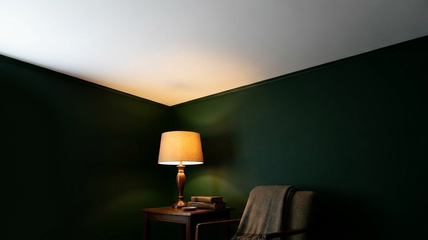
That jarring feeling you get when the lamps click on and the walls suddenly seem to close in isn’t your imagination playing tricks. Brilliant white ceiling paint typically sits at around 85 to 90 per cent Light Reflectance Value, while a proper deep green wall colour often measures somewhere between 10 and 20 per cent. That’s an enormous gap for your eye to bridge, and it’s precisely why the room felt airy at three in the afternoon and strangely boxed-in by eight at night.
I learned this the hard way in my own sitting room years ago, painting the ceiling straight from the tin marked “brilliant white” without a second thought, convinced I was doing the sensible thing to keep the space light. During the day it looked rather smart. Come evening, with the lamps lit, the ceiling seemed to float away from the walls like a separate object entirely, and the corners where wall met ceiling looked oddly abrupt, almost as though someone had drawn a hard line with a ruler rather than let the room breathe.
Key takeaways
- A 70-point Light Reflectance Value gap between ceiling and walls creates a visual illusion of shrinking space after dark
- Your brain evolved to read room size from wall brightness—when that signal becomes inconsistent, it perceives walls closing in
- Lamplight behaves completely differently from daylight, exposing the design flaw you never noticed during the day
The Maths Behind the Muddle
Light Reflectance Value, or LRV, measures how much light a paint colour bounces back into a room versus how much it swallows whole. On a scale of 0-100, with 0 being black and 100 being white, LRV quantifies the amount of light a paint color will reflect or absorb on your walls. Absolute black will absorb all light and heat, while pure white will reflect all light. Paint decorators generally treat anything below 40 as a low reflectance, dark colour that soaks up far more light than it gives back, while colours in the 60-100 range are considered a high LRV and will reflect a lot of light.
A brilliant white ceiling paint sits right at the top of that scale, and Professional decorators often quote it as 80%-90% LRV. Deep, saturated greens, the sort that make a room feel like a proper woodland den, tend to sit far down at the bottom. Pair the two together and you’ve built yourself a room with two entirely different lighting personalities meeting at a single seam. Interior designers actually use this gap on purpose sometimes; LRVs can be used to change the feel and shape of a room. If you have very high ceilings, a color with a lower LRV than what you have on the walls will help to bring them in a little and make the room a little cozier. For smaller spaces, colors with higher LRVs will open them up a little. The trouble is that most of us aren’t choosing our LRV gap deliberately, we’re just grabbing the whitest white on the shelf because “white ceiling” is what our mothers always did.
There’s a financial angle here too that rarely gets mentioned. Research from the American Coatings Association found that the additional electricity requirements for these paints vary from 12% to 84% versus white walls, and the additional electricity burden of using relatively dark paints on interior walls is very real. So that deep green isn’t just changing how the room feels, it’s quietly nudging up your lighting costs too, which is worth knowing if you’re the sort who keeps half an eye on the meter.
Why Evening Light Makes It Worse
Daylight is forgiving. It pours in from a huge patch of sky, bounces off dozens of surfaces at once, and generally fills a room evenly enough that the eye doesn’t notice sharp boundaries. Lamplight behaves completely differently. It comes from a handful of small, fixed points, and it simply doesn’t travel the same way. Walls, ceilings, and floors reflect light. So when these surfaces remain dark, they absorb brightness. As a result, the room feels smaller and heavier. Your green walls, brilliant during the day thanks to reflected daylight bouncing off every pale surface in sight, become light-hungry the moment the sun goes down and only a lamp or two is doing the work.
There’s a proper physiological reason your brain reacts this way, not just a decorating quirk. The reason is physiological. The human visual system evolved in outdoor environments where the primary source of spatial information is the brightness of surrounding surfaces, the ground, the sky, objects at the periphery of vision. When we enter an interior space, the same system applies the same reading: the brightness of the walls and the ceiling tells us how bright and how large the space is. When the ceiling stays blazing white and the walls sink into shadow the moment the lamps take over, your brain reads that mismatch as the walls closing in, because it has nothing consistent to measure the room by. It’s also worth noting that dark corners shrink visual space, so placing floor lamps or wall lights there makes a genuine difference, something I wish someone had told me before I spent an entire weekend up a stepladder.
Fixing It Without Repainting the Whole Room
The good news is you don’t need to strip the green off entirely, and frankly you shouldn’t, because a well-chosen deep green is a gorgeous, cocooning colour that plenty of us have come to love. The fix is about softening the gap rather than eliminating it. Instead of reaching for the absolute brightest white on the ceiling, try a soft white or a warm off-white with an LRV closer to 70 or 75. It still lifts the room during the day but doesn’t create quite such a violent drop-off once the sun disappears.
Lighting arrangement matters just as much as paint choice. A single central pendant throws light straight down and does nothing for your walls, which is exactly the problem. Adding a couple of table lamps, or better still an uplighter tucked into a corner that washes light up the wall towards the ceiling, gives the green surface something to reflect and stops that stark ceiling-to-wall cliff edge. Warmer bulbs, the sort rated around 2700 Kelvin rather than a cooler daylight tone, also help the two surfaces feel like they belong to the same room rather than two different rooms stacked on top of one another.
Some decorators go the other way entirely and lean into the drama rather than fighting it, choosing a ceiling colour 2-3 shades darker than the wall color to deliberately create a snug, enveloping feel, which is precisely the opposite instinct to mine but works beautifully in the right room. There genuinely is no single correct answer here, only a question of whether you want your green room to feel bright and airy or wrapped and cosy.
A Small Habit Worth Adopting
Before you commit to any ceiling colour again, paint a large sample, at least the size of a tea tray, and look at it properly after dark with your lamps on, not just in the cheerful glow of a Saturday afternoon. Paint shops will happily sell you a tester pot for a few pounds, and it’s a far cheaper lesson than mine was, learned only after two coats and a very stiff back from all that reaching overhead.
Sources : paintingamericainc.com | ledmyplace.com