
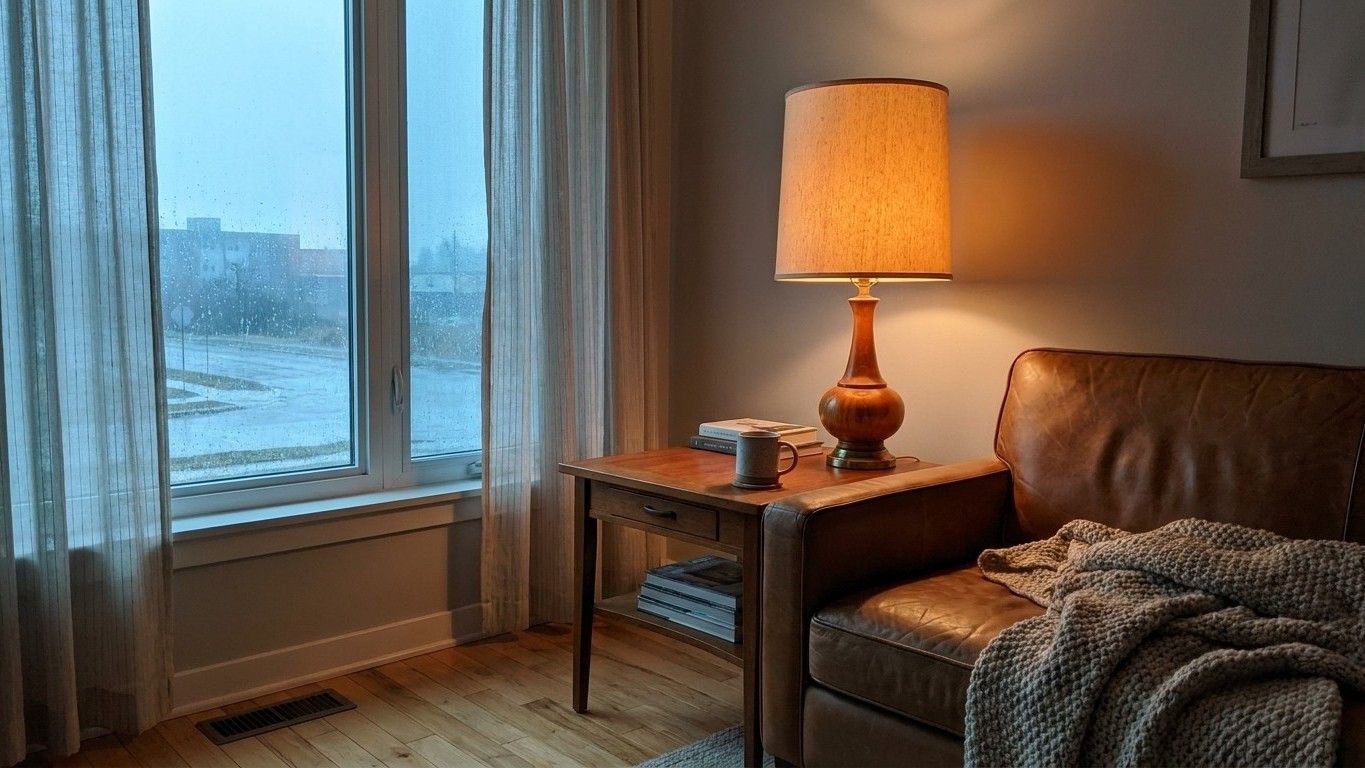
Chuck a fourth lamp into a gloomy north-facing lounge and you’ll likely end up with more light, not more warmth. The room still feels flat, grey, a bit clinical. The reason has nothing to do with wattage and everything to do with colour temperature, that invisible setting on every bulb box measured in Kelvin. Get that number wrong and you can flood a room with brightness while it still looks like a January afternoon in Aberdeen.
Key takeaways
- North light is naturally cool and blue—adding more of the same cold bulbs just layers grey wash onto grey wash
- The Kelvin number on your bulb box determines warmth or coolness, but most people pick the wrong one by habit alone
- There’s a hidden second number (CRI) that explains why two ‘identical’ warm bulbs can make your sofa look completely different
Why north light behaves so differently
North-facing windows in the UK never catch direct sun, so what comes through the glass is reflected skylight rather than sunshine. South-facing light is a warmer, slightly yellow light, while north facing light is gray and can have a touch of blue. That’s not folklore, it’s basic physics: the blue end of the spectrum scatters more readily through the atmosphere, so a patch of open sky reads much cooler than direct sunlight. North light or blue sky is around 7,500 to 10,000 Kelvin, which is a startlingly high figure once you realise most living rooms are lit somewhere between a third and a half of that.
This is why the instinct to “just add another lamp” so often backfires. If the new lamp emits the same cool, bluish light as the tungsten-free daylight already seeping through the window, you’re simply layering more of the same grey wash. Painters and studio owners worked this out long before interior magazines did. North-facing windows remain constant through the day and year, and art studios with north-facing windows are almost always recommended to use 6500K lighting to match the consistent, blue-sky hue coming through the windows. That’s a deliberate choice to match the coolness for colour-accurate work, not something most of us want in a room meant for reading the paper or watching telly of an evening.
The Kelvin number that actually fixes the problem
Every bulb sold in Britain carries a Kelvin figure on the packaging, even if it’s printed in small type next to the lumens. The lower the Kelvin number, the warmer, more yellow or red, the light; the higher the number, the cooler, more blue or white it becomes. For a north-facing room already drowning in bluish daylight, the fix isn’t more lumens, it’s a lower Kelvin bulb that counteracts the cast rather than adding to it.
- 2700K to 3000K: warm white, the closest match to old-fashioned filament bulbs, ideal for sitting rooms and bedrooms
- 3500K to 4100K: neutral white, useful in kitchens or home offices where you want warmth without losing sharpness
- 5000K and above: daylight white, best kept for utility rooms, garages or bathroom mirrors where clarity matters more than cosiness
For comfort and relaxation, 2700K to 3000K is the ideal range for living rooms and bedrooms. In a north-facing room, that warmth does double duty, it makes the space feel inviting and it pulls against the natural blue-grey light rather than reinforcing it. My own north-facing kitchen used to feel like the inside of a fridge until I swapped four daylight bulbs for warm white ones with roughly the same lumen output. Same brightness on paper, entirely different feeling in the room.
The number most people never check: CRI
Kelvin tells you the colour of the light itself, but it says nothing about how well that light shows off the actual colours in your room, your sofa fabric, your paintwork, your skin tone. That’s a separate measurement called the Colour Rendering Index, or CRI. It is an assessment of how the light source shows object colors naturally when compared to a familiar basis of reference, either incandescent light or daylight. The colour rendering index is measured as a number between 0 and 100; at zero, all colours look the same, while a CRI of 100 shows the true colours of the object.
This is the figure that explains why two bulbs with identical Kelvin ratings can make the same green cushion look either lively or muddy. Ideally, you should aim for a CRI of 90 or above, which ensures the colours you see under the light are as close as possible to how they would appear in natural light. Cheaper bulbs sometimes get their warm colour temperature by heavy filtering rather than a genuinely full spectrum, and the CRI figure is where that shortcut shows up. It’s worth hunting for it on the box, or on the retailer’s spec sheet if it isn’t printed, because CRI is independent of colour temperature, and a 5000K fluorescent light source can have a CRI of 75 while another with the same colour temperature has a CRI of 90. Two bulbs, same warmth or coolness, wildly different honesty about colour.
Putting it together without overspending
You don’t need to rewire the house to test this. Buy one warm-white bulb (2700K to 3000K, CRI 90 or above if you can find it stated) for the lamp nearest your favourite chair before replacing the rest of the room. Notice whether the space feels calmer within a few days, then decide whether the other fittings need changing too. Layering matters as well, a single bright overhead light in the correct colour temperature still throws harsh shadows, whereas two or three smaller warm lamps at different heights spread that colour more evenly and flatter the room the way soft afternoon sun would if you actually had any.
One quirk worth knowing before you buy: a bathroom or kitchen with north light and a cool white bulb overhead can cast a faint greenish tinge onto pale walls and skin, simply because there’s no warm light in the mix to balance it. If your bathroom mirror has been making you look a bit peaky lately, check the Kelvin figure before you check your diet.
Sources : northluxlighting.com | wtlighting.co.uk