
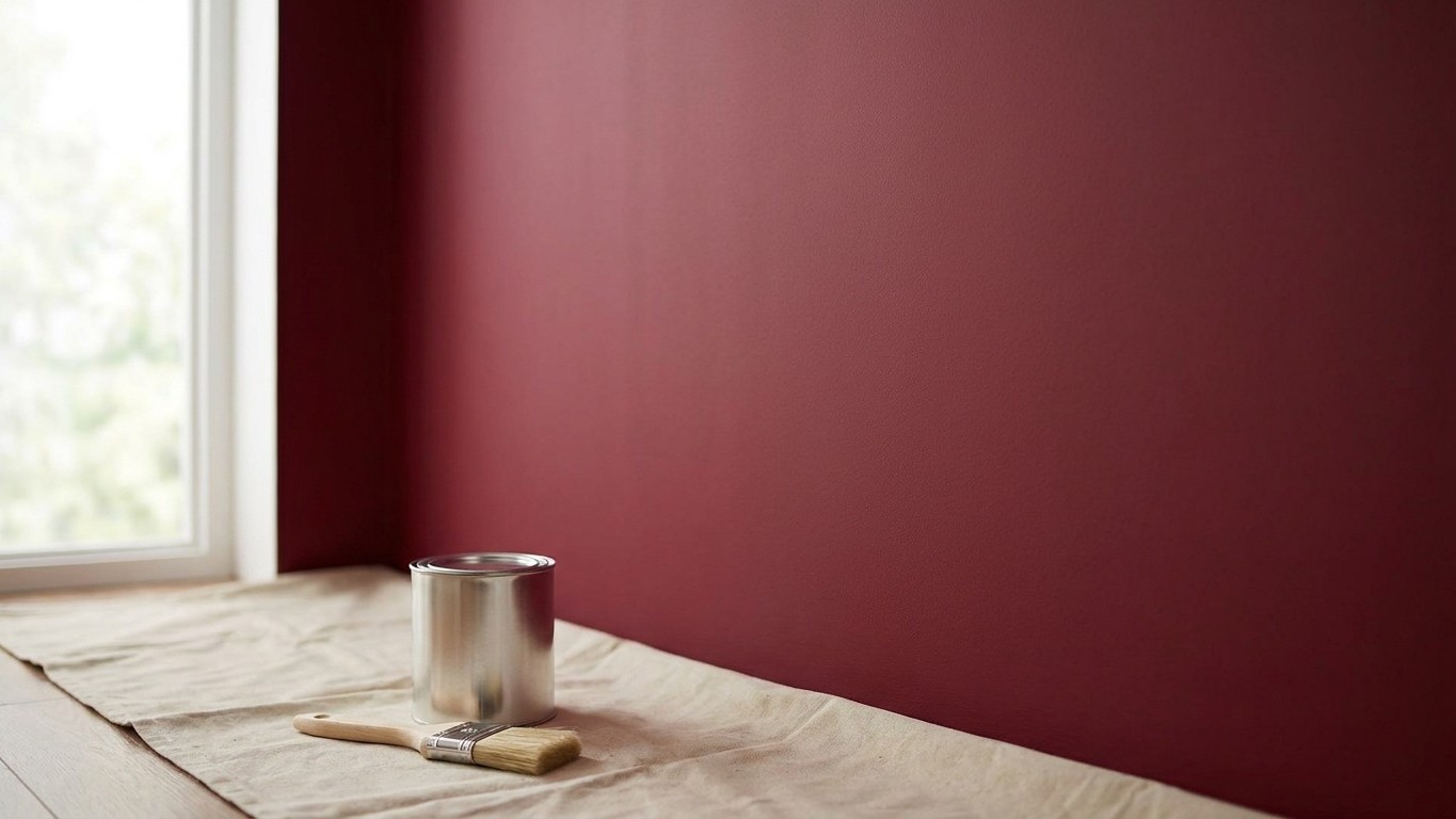
Four coats of pillar-box red and the wall still looks patchy? You’re not doing anything wrong, and you’re certainly not being wasteful with your painting technique. The real culprit is hiding in plain sight: what went on the wall before your lovely red or sunshine yellow ever touched it. Get that single undercoat layer right, and two coats of even the trickiest colour will do the job beautifully. Get it wrong, and you could be up a stepladder with a fourth coat on a Sunday evening, wondering where it all went wrong.
Key takeaways
- Red and yellow pigments are naturally translucent—they physically can’t hide what’s beneath without help
- A single tinted undercoat can cut your topcoat needs from four coats down to just two
- Professional decorators have used this trick for decades, and paint shops will tint primers free of charge
Why reds and yellows behave so badly
There’s genuine chemistry behind your frustration, not just bad luck. Red and yellow paint does not cover well because its pigments are naturally translucent rather than opaque, and red pigments require dyes that allow light to pass through, resulting in a thin, streaky finish. Think of it a bit like trying to hide a newspaper headline with a sheet of coloured cellophane rather than a piece of card.
Most other colours, your greys, your greens, your muted blues, rely heavily on titanium dioxide, a white pigment that’s brilliant at blocking out whatever lies beneath. Extra deep and extra bright colours have lower opacity because they start out in a “clear” base which contains only calcium carbonate, with very little titanium dioxide added to keep these colours vibrant. Manufacturers aren’t being stingy on purpose. Reds, magentas, and yellows simply aren’t “earth-based” colourants, unlike the iron oxide pigments that give us browns, terracottas and muted reds, which happen to cover far more generously.
There’s a cost angle too, and I do love explaining the economics behind these things. True red pigments are expensive, while iron oxides, both red and yellow, are a lot cheaper and help produce a more durable film. Add in that the small particle size of the red pigment tends to add body to the wet film, and you end up with paint that looks perfectly thick in the tin but goes on far thinner than you’d expect once it hits the wall. One DIYer summed up the frustration rather well after painting a bedroom, describing how it took four or five coats not to mention the tinted primer. That’s the sort of afternoon that turns a nice weekend project into a small ordeal.
The single layer that changes everything
Here’s where your grandmother’s common sense meets modern paint science rather nicely. The trick isn’t a magic paint, though some premium ranges do perform better, it’s what goes underneath. A properly tinted undercoat, or a grey-tinted primer, closes the gap between your base colour and your final shade before the red or yellow ever has to do the heavy lifting on its own.
Professional decorators swear by this, and for good reason. Using an undercoat when changing from a light colour to a dark one, or vice versa, creates a more even base, and applying a white undercoat over a dark surface, or a tinted undercoat that matches your new topcoat, can help you achieve full coverage in just two coats of your topcoat. Skip that step and you’re rolling the dice. Without an undercoat, you may need three or even four coats, and even the highest quality trade paints can struggle with full coverage when making a dramatic colour change without the help of an undercoat.
For reds specifically, grey is your best friend rather than white. Always use a grey, not red, tinted primer, and any paint store will tint your primer grey for free, though there is a limit because too much tint affects the primer’s ability to seal and block stains. A neutral grey base neutralises the light bouncing back through that translucent red pigment, so instead of ending up with something closer to salmon pink on your first coat, you get proper depth straight away. Greys cut light reflection through sheer tint bases, allowing a colour like burgundy to be more colour-correct with fewer coats.
Yellows benefit from the same logic, though a warmer buttery undercoat can sometimes work better than stark grey depending on the final shade. Laying down a primer coat of similar, high opacity paint first, such as a buttermilk yellow under a sunglow finish or a brick red under a holiday red, makes a real difference. The idea is simple: match the tone roughly, get the opacity sorted with a cheaper, more forgiving product, then let your expensive statement colour do only the job it’s actually good at, which is looking gorgeous, not hiding a plasterboard wall.
Getting it right without wasting a drop
Before you even open the red or yellow tin, ask your paint counter to tint a litre of primer or undercoat to roughly half the strength of your final colour. Most shops will do this free of charge, and it’s the single best pound you’ll spend on the whole project. Let it dry fully, following the tin’s guidance, because rushing this stage undoes all the benefit.
A few practical notes worth tucking away. Bright, saturated tones are far more forgiving over a matched undercoat than over bare plaster or old white emulsion, where the dark or contrasting colour may continue to peek through even after three or more coats of paint if you skip priming altogether. Sheen matters as well. Paints with sheen tend not to cover as well as flat paints, so if you’re set on a silk or satin finish in red, budget mentally for that extra coat regardless of how good your undercoat is.
Quality of paint does still count for something, though it’s not the whole story. It’s one of the paradoxes of interior paint that deep, dark colours often provide thin coverage even over lighter walls, because these richer hues may not contain titanium oxide or other white pigments that deliver optimal hiding. A premium tin will always outperform a budget one, but even the best red on the market still leans on a good undercoat to look its best.
One quirky detail that surprises most people: some professional decorators tint their undercoat slightly lighter than the final shade on purpose, not to match it exactly, simply so they can still see brush marks and rolling patterns clearly while working, then let the true colour do its job cleanly on top. It’s a small habit, but it’s the sort of thing that separates a smooth two-coat finish from a weekend spent chasing a fourth coat you never really needed.
Sources : generalfinishes.com | loconsolo.com