The floor is the largest uninterrupted surface in any room, larger than any single wall, larger than the ceiling in our visual awareness because we actually look across it. Yet most of us, when a room feels cramped, reach straight for the furniture catalogue. We consider swapping the sofa, decluttering the shelves, painting the walls white. The real culprit is almost always lower down: the flooring itself, and the narrow strip where it meets the wall.
Key takeaways
- The largest surface in your room is being ignored—and it’s sabotaging your sense of space
- One architectural element running around your entire room is visually slicing it smaller without you realizing it
- A 45-degree angle trick forces your brain to perceive rooms as dramatically larger than they are
Why your eye is the problem, not your square footage
Flooring serves as the single largest canvas in any room, and its visual characteristics have a profound effect on our perception of space. In compact rooms, selecting the right flooring material, colour, and layout can trick the eye, making the area feel significantly more open, airy, and expansive. That is not a matter of opinion, it is how human spatial perception actually works. Our brains judge the size of a room by reading visual cues at floor level first, before we process walls or ceiling height.
The two mistakes people make most reliably? Choosing the wrong scale of flooring, and ignoring the junction between floor and wall entirely. Both are invisible until you know what to look for.
A common misconception is that small rooms need small details, but the opposite is true for flooring. Narrow boards create dozens of seams across the floor. To the eye, this looks like clutter or “noise,” which makes a room feel busy and enclosed. Think of it like a tiled bathroom where the grout lines multiply endlessly underfoot, your brain reads all those lines as boundaries, and the room shrinks accordingly. Bigger planks or tiles actually make small rooms feel less cluttered, because fewer seams mean fewer visual breaks in the floor, which keeps the eye moving and helps the space feel uninterrupted.
The direction you lay the floor changes the shape of the room
Plank direction is one of those choices that feels irrelevant until you see the difference side by side. The direction in which your planks or tiles are laid can dramatically influence the perception of depth and movement in a room. Laying planks parallel to the longest wall draws the eye along the longest dimension, visually stretching the space and making it feel much deeper than it actually is.
For rooms that are nearly square, often the trickiest to work with, there is a bolder option. Laying planks or tiles at a 45-degree angle is a powerful design trick. This forces the eye to follow the diagonal, irregular path, confusing the brain’s spatial processing and creating an effective sense of width and depth. The diagonal is the longest straight line you can draw in any rectangular room, which is precisely why it works so well. Diagonal lines are the longest straight lines you can create in a rectangular room, and the eye obliges by reading the space as larger than it is.
Colour plays a supporting role too. Light floors reflect more natural and artificial light, making a room appear more open. Shades like light oak, maple, beige, or even whitewashed styles are great options. Pair them with light-coloured walls for an airy, seamless look. That said, dark floors are not automatically a disaster. The key is contrast: pair dark floors with light-coloured walls, ceilings, and furniture to create a balanced, airy look. A small dining room with dark walnut flooring can still feel open if the walls are painted a crisp white and the furniture is light and minimalist. Dark flooring also works well in spaces with plenty of natural light, as the sunlight helps counteract the dark tones.
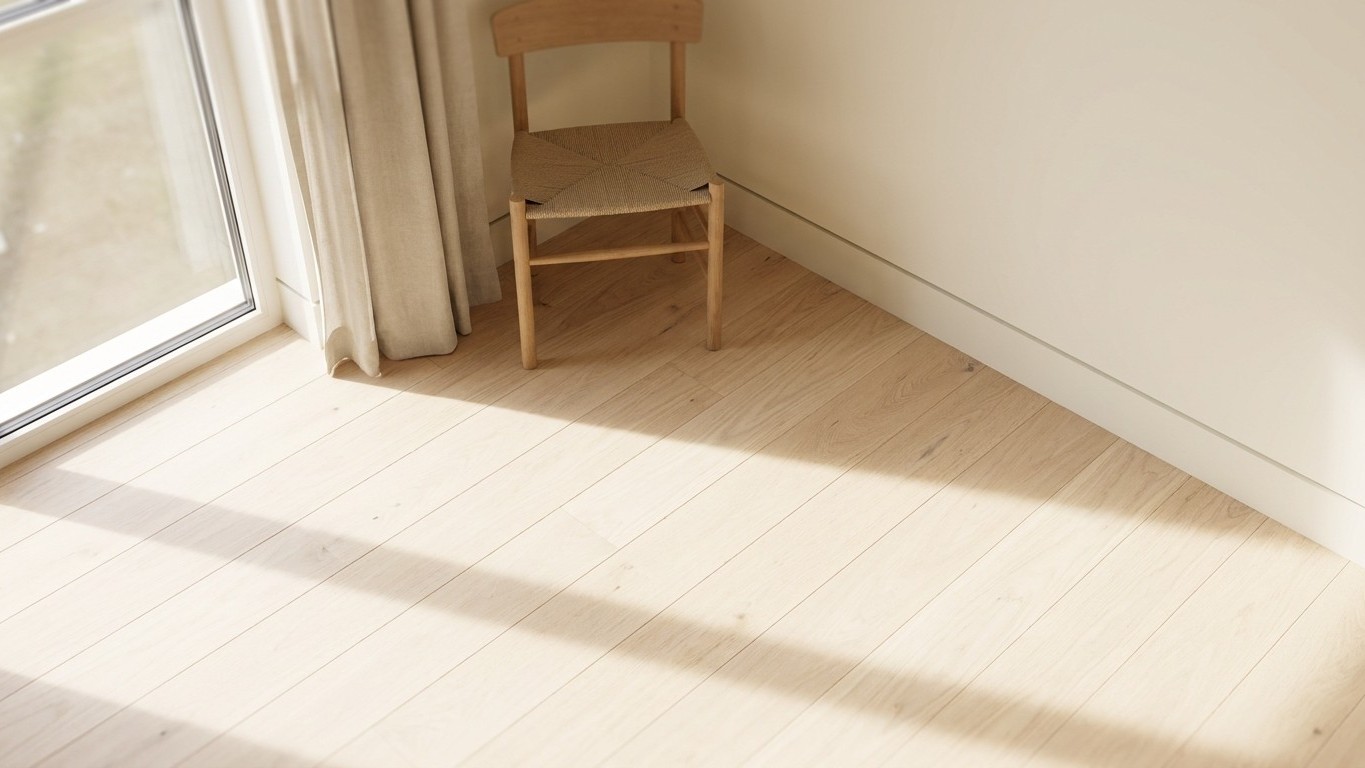
The skirting board problem nobody talks about
Here is what the furniture-rearranging approach misses completely: the strip of skirting board running around the base of every wall. Skirting boards create a thick, dark band around the room. That band interrupts the wall, cutting the height and drawing the eye downwards. In smaller living rooms or low-light spaces, that simple strip can make volumes feel heavier and ceilings appear lower. The effect is compounded when the skirting is painted a different colour from the wall, it becomes a visible horizontal line running the entire perimeter of the room, visually slicing the walls shorter than they actually are.
The right skirting board height is a clever trick designers use to manipulate a sense of space. A taller, well-proportioned skirting board can actually draw the eye upwards, making ceilings feel higher and a room feel more spacious and elegant. The reverse is equally true: in small rooms or with low ceilings, very tall skirting (300mm or more) can make spaces feel cramped. The key is proportion, skirting should complement, not dominate the room.
The solution used in contemporary architecture goes further still. A shadow gap refers to a narrow recess or gap between two surfaces, typically a wall and floor. It creates a subtle shadow line effect. Shadow gaps are a popular contemporary interior design feature. The shadow gap creates a sense of separation and lightness. It makes surfaces look crisp and defined. This floating effect can make a room feel larger and more refined. Rather than adding trim that draws the eye down, a shadow gap does precisely the opposite, it can have a major impact on the perceived size of a space. By eliminating that visual “break” at the bottom of the wall, rooms instantly feel more expansive and elevated.
For those not embarking on a full renovation, the simplest version of this principle is free: paint your skirting boards the same colour as the walls. For small spaces, instead of going for contrasting colours, just match the colour of the skirting with the wall. This detail will give a seamless look and an enhanced sense of space. It is, genuinely, one of the cheapest improvements available to a British homeowner.
The rug mistake that undoes everything
You may have done all of the above and still find the room feels chopped-up. The rug is very possibly to blame. The most common rug placement mistake in small rooms is a rug that is too small. When the rug is too small, it sits in the centre, disconnected from the furniture around it. The room looks broken. The furniture looks too large. The space feels tighter than it is.
Thick, high-pile or shag rugs add visual weight to a room. In a small space, that extra bulk makes the room feel heavier and more crowded. A low-pile flatweave, on the other hand, sits quietly without eating into your visual square footage. And continuity across rooms matters just as much. When moving between small, adjacent spaces, consistency is your friend. By removing transition strips and maintaining the same floor line from room to room, you visually dissolve the boundaries between the spaces. The eye has nowhere to stop, and the whole home breathes.
One thing worth knowing that surprises people: flooring with a polished or semi-gloss finish reflects more light, which can brighten up tight spaces. This works particularly well with tile, luxury vinyl, or hardwood flooring. Just remember that glossier finishes may show scratches more easily, so they are best in low-traffic rooms. For a bedroom or a study, the rooms that most often feel small, a light-toned engineered wood with a semi-gloss finish can do more work than any mirror you hang on the wall.
Sources : denvercarpetandflooring.com | ptfloors.com