
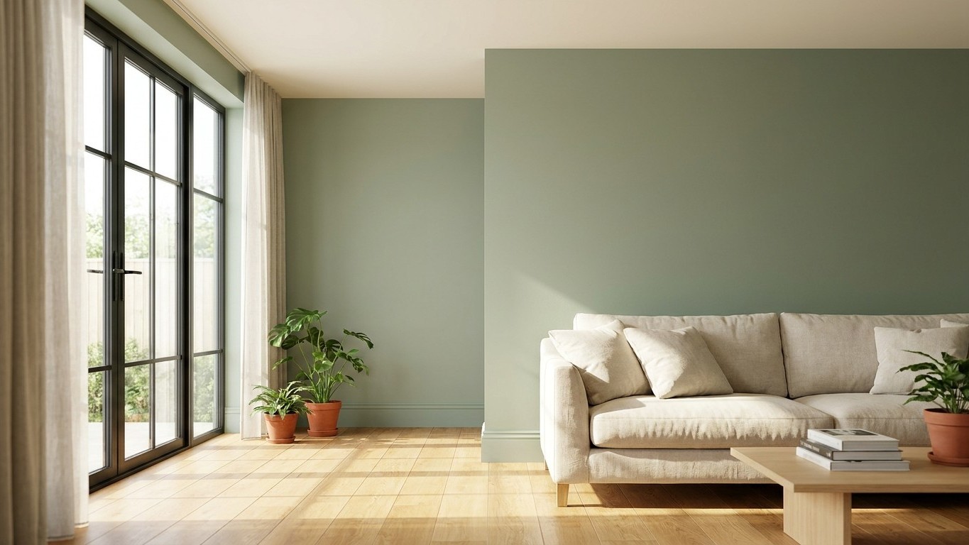
Painting the skirting board the exact same colour as your walls is the trick decorators are reaching for this year, and it does something rather clever: it tricks the eye into reading the wall as one continuous surface, so the ceiling appears to sit higher than It Actually Does. No hard white line at floor level, no visual “stop” telling your brain where the wall ends. Just one smooth sweep of colour from carpet to cornice.
It sounds almost too simple to work, but the logic is sound. When you remove the stark line of white trim, your walls appear taller and the whole space feels more connected. It’s a particularly effective trick in small living rooms or spaces with lower ceilings, where that sense of height really matters. Interiors expert Lee Trethewey puts it plainly: “Painting your skirting boards the same colour as your walls removes visual boundaries and draws the eye upwards, rather than downwards.”
Key takeaways
- White skirting boards are finally falling out of favour—but there’s a clever reason why
- One simple painting technique can visually add height to any room with low ceilings
- The trend extends beyond skirting: colour drenching is reshaping how we think about interior walls
Why brilliant white finally lost its grip
For decades, gloss white skirting was simply what you did, a hangover from an era when contrast trim was considered the mark of a “finished” room. But plenty of designers have grown tired of that harsh line. There’s a lovely comparison that’s done the rounds in design circles, likening stark white skirting against a coloured wall to “white socks popping out the bottom of trousers”, an image credited to designer Kelly Hoppen that sums up exactly why so many of us wince at that jarring band of brightness once we’ve noticed it.
Once you eliminate that break, something genuinely happens to the geometry of a room. When you paint the skirting boards the same colour as the walls, you eliminate visual breaks, and the eye travels without interruption, which gives the illusion of a taller wall and a more expansive space. That’s particularly good news if you’re renting or living in one of the countless Victorian terraces or 1970s boxy semis that make up so much of British housing stock, where low ceilings are often just something you learn to live with rather than fix.
Colour drenching: the trend giving this trick its name
This skirting technique has a bigger sibling doing the rounds in 2026, and it’s called colour drenching. It means painting every surface in the same hue, so walls, ceilings, doors, skirting boards, and even radiators become part of one continuous canvas. The interest in this approach has genuinely exploded rather than simply trended online: the Zillow Home Trend Report shows mentions of this immersive painting technique have jumped by 149% year over year.
What’s interesting is how the trend has softened since it first appeared. Colour drenching is still very much a defining trend for 2026, but it has matured, moving towards softer, more liveable tones rather than the bold, saturated shades of earlier years. Sage greens, warm clay, dusky blues, and muted olives are doing the job that a punchy jewel tone once did, giving you that cocooned, settled feeling without turning your sitting room into a fairground.
There’s a proper technique behind the finish too, and it’s one worth knowing before you pick up a brush. Designers tend to recommend playing with paint finishes to give depth without disrupting the unity, so a matte wall with satin skirting boards catches the light in a subtle way, a small detail that makes the space feel layered and quietly refined. In practical terms, that means matt emulsion on your walls and ceiling, then an eggshell or satin finish on the woodwork itself, still the same colour, just with a slightly different sheen so the trim doesn’t disappear entirely into flatness. It’s also more forgiving for skirting, which takes a battering from hoovers and toddlers and needs a wipeable surface.
How to get it right without wasting a single tin of paint
Before you commit a whole weekend and your good clothes to this, there are a few things worth thinking through. Not every room suits the full drench. If you’ve got ornate Victorian skirting or a lovely dado rail you’re proud of, painting it the same colour as the wall will genuinely hide it, so contrast might be the better call there. Very dark colours in low-light rooms can make a dim space feel a bit gloomy when taken floor to ceiling, so if your room already struggles for daylight, test a sample first rather than diving straight into a moody charcoal.
There’s also a gentler variation if the full monochrome feels like too big a leap. Tonal drenching, sometimes called double drenching, works within the same colour family rather than a single flat hue. It involves working with two shades from the same colour family, light walls with a slightly darker ceiling or vice versa, creating harmony and depth. There’s a related trick called colour capping too, where you paint your walls in graduated tones of the same colour family, typically starting darker at the bottom and transitioning to lighter shades as you move toward the ceiling, and the effect on a low ceiling is much the same as matching your skirting: lighter tones near the ceiling draw the eye upward, making a room appear taller, because your eye naturally follows the gradient upward, which tricks the brain into perceiving more vertical space.
Budget-wise, this needn’t be an expensive weekend. You’re not buying two different tins, contrast trim paint and wall emulsion, but essentially one colour in two finishes, so you can often get away with a standard matt tin for the walls and a smaller eggshell tin for the skirting and door frames, which tends to work out cheaper than the traditional “white gloss plus feature wall” combination most of us grew up with. Test a sample patch on both your wall and an offcut of skirting first though, ideally checked in morning and evening light, because paint that looks perfectly matched on the tin lid can shift surprisingly once it’s dry and under different bulbs.
One last thing worth remembering: consistency matters more than the colour itself. If your skirting matches the walls, your door frames and architraves should follow suit too, otherwise you’ll end up with a room that looks like it was decorated in stages by three different people with three different opinions, rather than one deliberate, calm scheme.
Sources : homebuilding.co.uk | womanandhome.com